Methodology
A System for Purposeful Digital Experiences
We don't design websites; we build precise, user-centric systems that operate within real-world constraints. Every project begins not with a mood board, but with a rigorous audit of your business objectives, your users' needs, and the technical boundaries that shape the outcome.
This is our methodology. It is less a linear path and more a series of strategic checkpoints, designed to eliminate ambiguity and ensure that every pixel serves a measurable purpose. Below is an index to our key operating principles.

"Our process is anchored in the specific reality of your context, much like Prague's geometry is grounded in its street grid."
The Prague Brief: Where Every Pixel Has a Purpose
Foundational Philosophy
Our first meeting is not about aesthetics; it's a diagnostic session. We use a proprietary tool called the Outcome Canvas—a single-page framework that forces a direct link between your business objective (e.g., reduce support tickets by 20%) and a user outcome (e.g., find the answer in under 30 seconds). This prevents aesthetic drift and keeps every decision tethered to a metric.
We reject "more is more." For a Prague-based fintech client, their original homepage featured 12 competing call-to-action buttons. Our audit revealed that each button fractured user attention. We reduced it to one primary CTA, supported by clear information architecture. The result was a 40% increase in qualified lead conversion, not by adding features, but by removing cognitive noise.
Every project begins with a Pre-Mortem. We gather the team and ask: "It's 12 months from launch. The site has failed. Why?" We work backward from that failure. This exercise uncovers hidden risks—the client's CMS has rigid templates, the hosting budget is too low, the development team's skills don't match the tech stack. By planning for failure, we engineer for success.
Transparency is non-negotiable. You don't need to micromanage us, but you should never wonder what's happening. Every client gets access to a live Project Pulse dashboard. It's a simple, private view showing design iterations, feedback threads, and milestone progress in one place. No surprises, just clarity.
Prague's Signature: A Case Study in Local Context
Applied Methodology
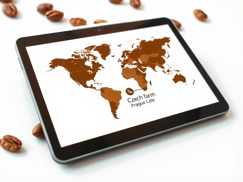
The 'Bean-to-Cup' interactive map replaced a standard carousel, becoming the primary engagement tool.
Client: Kavárna Mír
A specialty coffee shop in Vinohrady. Goal: Increase online orders and communicate their unique roasting process.
Constraint
The client's team had limited technical skills. The CMS needed to be visibly simple, with a visual editor for their daily menu and blog posts.
Insight & Solution
We discovered their key differentiator wasn't the coffee itself, but the narrative of the beans' journey from a specific Czech farm. We built the entire UX around this story, replacing a generic hero carousel with an interactive Bean-to-Cup map on the homepage. This became the primary engagement tool, allowing users to trace the origin.
"The story of their beans' journey was the real product. We just built the map."
+220%
Online orders in 3 months
Local
Talk of the Vinohrady neighborhood
The Design Sprint: From Wireframe to High-Fidelity
Iterative Process
Structural Integrity (Black & White)
We build in grayscale. The focus is purely on information hierarchy, user flow, and task completion. If the structure doesn't work in black and white, color and polish won't fix it.
Component Library (The System)
We design a system, not just pages. Every button, form field, and card is defined in a shared Figma library. This ensures consistency and makes future updates scalable, not chaotic.
Micro-Interaction Audit (The Language)
We document every hover state, transition, and error message. A loading spinner isn't just a spinner; it's a moment of brand communication. This phase defines the site's personality.
Pitfall Avoidance: Design for The Empty State
We actively design the 'zero-data' moment. A user's first interaction with a dashboard or portfolio is often empty. We design that moment to be instructive, on-brand, and never a dead end.
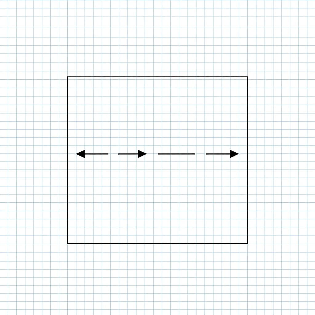
Early wireframes are annotated with specific user goals, not aesthetic notes.
Constraints We Navigate
Assumptions, Boundaries, and Triggers for Change
Budget Limits
Software licenses (Figma, CMS, hosting) are often the first cut. We provide cost-equivalent alternatives that don't sacrifice quality.
Legacy System Integration
API response times of 2+ seconds dictate UI patterns. We design skeletal loaders and progressive disclosure to maintain perceived performance.
Bilingual (CZ/EN) Content
Czech words are 20% longer on average. We design flexibles layouts and test with variable-length UI copy to avoid breakage.
GDPR Compliance
It's not just a banner. It affects data collection flows, consent management, and user data export mechanisms in the CMS.
Trade-Off Frames
Benefit vs. Cost & Mitigation Strategies
Benefit: Total control, unique interaction. Cost: High dev time, maintenance burden.
Mitigation: Isolate in a dedicated module; document rigorously.
Benefit: Speed, community support. Cost: Less unique, version dependency.
Mitigation: Choose libraries with long-term support; plan for major version updates.
Benefit: Brand consistency, polish. Cost: Rigid, breaks on edge cases.
Mitigation: Design system with flexible constraints, not fixed pixels.
Decision Lens
Criteria & What Changes Our Mind
What We Optimize For:
- Does it reduce user error rates?
- Is the implementation cost within budget?
- Can we maintain this with your current team?
What We Sacrifice:
- Unnecessary animation for its own sake
- Designing for "mood" over user tasks
- Features that lack a clear user outcome
What Changes Our Mind:
- User testing reveals a critical flaw.
- Legal flags a compliance issue.
- Dev team estimates 3x cost for a "simple" feature.
The Handoff: Beyond the Launch Date
Our Commitment Post-Launch
Our job isn't done when the site goes live. We hand over a comprehensive Launch Kit to ensure your team owns and can evolve the product.
Style & Component Guide
Access to the live Figma library and a documented Storybook for all components.
CMS Training
Video walkthroughs and a 30-day warranty period for bug fixes related to the CMS.
Performance Baseline
Pre- and post-launch Core Web Vitals report for future benchmarking.
30-Day Check-in
A scheduled review of analytics and user feedback to plan the first iteration.
Future-Proofing Clause: Our contracts include a technology review point at the 18-month mark to ensure the site doesn't become a legacy system.
Ready to build with purpose?
Let's discuss your project and see if our methodological fit aligns with your goals. We'll start with the Outcome Canvas, not a mood board.
Start the ConversationOr call us: +420 222 514 444